27.10.11

Macedonia Baptist Church, Detroit, MI


Macedonia Baptist Church is a growing Baptist Church on the west side of Detroit, MI. In 2004, they decided to expand their church in order to meet their growing congregation. The original church, a 1940s brick structure, is situated parallel to Southfield Freeway and had a fairly minimal presence to cars traveling along the freeway.


The overall concept of the project was to provide the church with more of an overall community presence while creating a well lit central gathering space for the congregation before and after services. A modern steel framed perpendicular addition was proposed for an atrium gathering area. A precast concrete panel facade was used as a means of creating a contrast between the new structure and the old.


The pastor also desired to have a space for himself in order to hold meetings with the church board as well as do any counseling. So a smaller addition was conceived for the North side of the church that incorporated a small garage as well as an office area for the pastor.


The two additions were tied together with a badly needed new standing seam steel roof. The color created much debate between the various parties involved in the design, but a teal roof was decided up in order to give the building a tad more color (the original roof was the same color as the brick).


During the early design phase of the project, Pastor Twyman expressed a concern that the structure didn't have the presence that the congregation had desired. So, a spire was added to the design in order to give the structure the height it needed in order it to have the presence they desired. An office design competition was implemented and as it turned out, the Pastor and his congregation favored my spire design overall, so it was incorporated into the final design.


The construction documentation phase of this project was quite challenging. The Structural engineer created a number of problems with everything from the HVAC planning to the precast clips by specifying steel sections that were under production at that time. So, all of the steel detailing had to be resubmitted numerous times and the final construction time was extended by two years.


The final product was completed in 2006, which consequently was well after I had left DCJA. So I had never really had the chance to document the project until now. In town for a short weekend with my family, I decided to go and take some pictures and I must say, I am proud to have this project in my portfolio.


17.7.11

Is the old school way of finding any job dead?

I have been looking, with zero luck, for a long-term and a full-time job within the city of Chicago, IL for about three years now. As, one might imagine, this process has been a roller coaster ride of emotions ranging from elation to hopelessness. In my most recent attempt to find a job, I decided to step up my documentation of the process and be able to create a comprehensive set of results. I believe I am finally ready to reveal those results in a manner which will fully illustrate the nature of my struggle.

On April 3rd of this year, I sent out 428 resumes and cover letters via mail. Of these resumes I sent out 41 that included a miniature portfolio to those firms that I most desired to work for. As of today, I have yet to attain any form of job offer, let alone the long-term/full-time job offer I have been hoping for. The Diagram below breaks down the  results of my job search based on 3 factors: Whether firms responded or not, How they responded, and if I ended up receiving an interview.


So, as you can see, the results are fairly dismal. For clarity's sake, I did not examine which of the forms of response resulted in an interview. The 3 phone responses resulted in interviews and 1 of the emailed responses resulted in an interview. Also, I got no responses from any of the firms I sent my portfolio to. Obviously, the interviewing process is fairly subjective. I get the feeling that I either was overqualified for the positions I interviewed for or I simply wanted too much money. There is really no way of telling, though.

It seems as if there is a strong disconnect these days between employers and job candidates. I find the number of firms that do no to respond to a job candidate at all astounding. It seems as if no one wants to admit that they simply do not have the resources to expand their firm or they are just simply bombarded on a daily basis of the over-saturated job market. The real kick in the face of this exploration though, is the fact that of those 4 interviews, I never once received any form of follow-up after the interview. Firms really need to get their acts together and start actively participating in the hiring process, rather than focusing on getting the correct candidate and forgetting the remainder of candidates exist.

In terms of numbers of dollars spent on this endeavor; I spent 188.32 dollars on postage, 200.00 dollars on printing cost, and over 12 hours of my own time putting together the list and doing the mailings (I would estimate this at a rate of 20 an hour). So, all and all, the total cost to me was 688.32 dollars.With that said, is it worth it? I dont think so.

The debate of traditional mailings vs. email mailings will never be over. In my mind, I prefer my prospective employers to be able to have a hard copy of my information so that it wont just sit in their inbox and be easily ignored. But, obviously from my study, it is just as easy to ignore a hard copy of a resume.

As much as I hate to end this discussion "Michael Moore Style", I do not think that there is any solid answer to any of these issues. I am just glad to be able to share the results.


12:00pm Central
18.7.11
IRONIC EDIT: 

Earlier today I got a permanent/full time job offer from one of my interviews as a project manager. I suppose it took a wee bit of time and some internet ranting. Life is funny that way.


8.7.11

Alligator HOUSE v 2.0

Some of the renderings I did for Rusty Long of a modernist residence that will be located in Columbia, North Carolina near the Alligator River National Wildlife Refuge.


Rear Elevation


Front Elevation


Porch Perspective

More work, rants, and items of interest to come!

24.5.11

Mecanoo Architecten: My new favorite firm


The competition-winning design for the new Cultural Complex in Shenzhen. Visualization by Doug and Wolf


As posted on Bustler today, Mecanoo Architecten has been selected as the winner of the competition put out by the district government of Shenhzen, China to design a "Cultural complex of 83,500 m2 with public art museum (13,500 m2), science museum (16,000 m2), youth centre (8,000 m2) and a bookshop (25,000 m2) and 22,500 m2 of underground parking and a new public square totalling 7 hectares" 


The competition-winning design for the new Cultural Complex in Shenzhen. Visualization by Doug and Wolf

The planning of this project is probably some of the best I have ever seen. The built structure is broken into four structures that all seemingly flow into one another and simultaneously tie into the very traditional public square. Both the square and the surrounding commercial district are tied together by the pathways created by the arches. This building acts in a way that unites the two entities together by creating a filter of sorts between them.

The competition-winning design for the new Cultural Complex in Shenzhen. Visualization by Doug and Wolf

Upon seeing the renderings for this project, I was immediately prompted to check out the firm's website. The ethereal  feeling that is produced in the renderings of this project blows my mind. The use of light and reflection in the renderings themselves causes me to simultaneously cringe and salivate at the idea of what this the final product of this project will look like. I have to admit, I AM a rendering junkie, but simplistic curves and arches of this project are what really draw me in.
By all means, this firm deserves a second look. Almost all of their projects (built and un-built) jump off the page at you, which to me deserves a nod of respect. I usually find that firms have a very hard time reconciling the differences between their renderings and the reality of the final products. My only complaint about good firms: They never build in the good old United States of America......

alligator.HOUSE

I was approached by a long time associate and friend of mine, Rusty Long, to do renders for the Alligator House he is designing in Columbia, NC. Rusty is from Cary, NC and I think this will turn out to be a potentially powerful collaboration between us.
View from rear with people and textures. Rusty loved this view.
View of the front of the house. I really love this reverse pitch roof, it seems like an excellent place for a few rain barrels.
View of the rear of the proposed house. Note the pool and excellent rear porch.


2.5.11

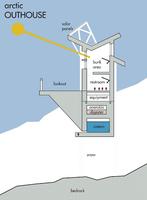
Outhouse Challenge: the arctic OUTHOUSE


This challenge was basically to attempt to design an outhouse around a specific environment. And, of course,the Arctic was the natural choice! Making the outhouse more of a self-sustaining "thermos" was main goal of the project from an environmental standpoint. The steel braced structure sits on a floating concrete base that acts as a water collection system using heating elements to melt snow as it piles around the base and collects that water in a cistern. A bright red steel clad exterior allows a strong distinction for fellow explorers. The exterior walls utilize 24" of insulation that keep the passive solar gain inside and the excessive cold outside.


The outhouse also acts as a year round refuge for explorers in need and a rendezvous point for rescue teams. It is solar powered and the anerobic digestion system provides a means of sustainably dealing with the waste produced while feeding the gas powered water heating system with fuel.

30.4.11

New Portfolio Cover

Table and Chair.

This furniture is designed to maximize the efficiency of simple materials such as: plywood, threaded rods, and tensioned wires. The efficiency of these materials comes from the forms and application of the materials themselves. Utilizing minimalism and structural formulation, each of the materials bring a specific structural property as well as a aesthetic theme to the overall feel for the furniture.

The dimensions of the chair and table are based ergonomically correct forms as well as modular components in order to create a comfortable and functional aesthetic.

The plywood portion of each piece has been formulated around the use of a maximum of a single 48"x96" sheet of plywood. Each plywood component is pre-finished and cut using cutting edge CNC technology to ensure a smooth finish.

The chair cushion is hand stuffed and sewn by a local artisans and is available in a variety of patterns, colors and fabrics. The table top can be manufactured from materials ranging from tempered glass to a high impact plexi-glass with a variety of colors and the potential for patterns to be screen printed.


Each piece will be custom manufactured on a per order basis after initial prototypes are finalized and constructed. Look for updates as I progress! 


All funiture designs seen are copyrighted by and property of BryanJSHARBOWSKI designs.

001

Welcome to my blog. I have a pile of goodies to share with everyone. This page will be under construction for awhile, but I will add content as I get it formatted. Thanks for coming.